How to Pick Photos for a Home Screen Widget
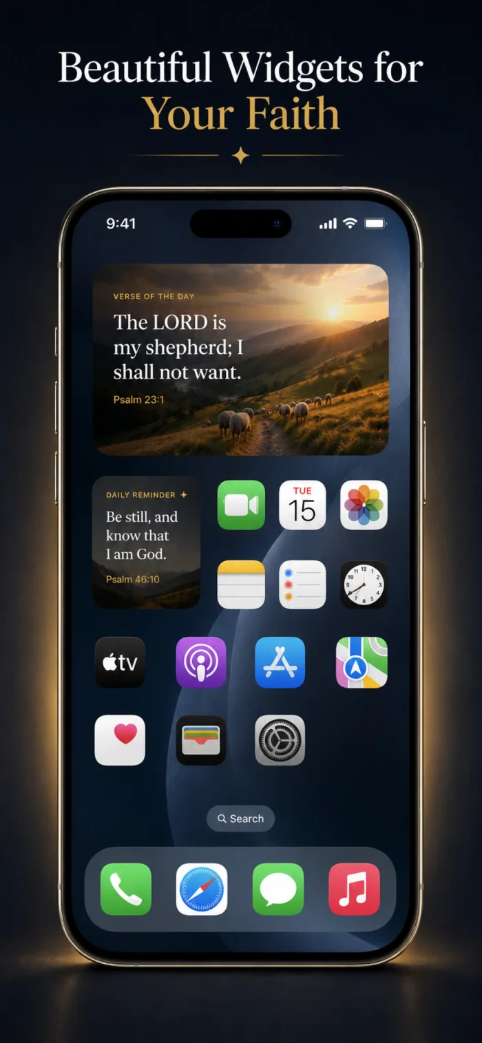
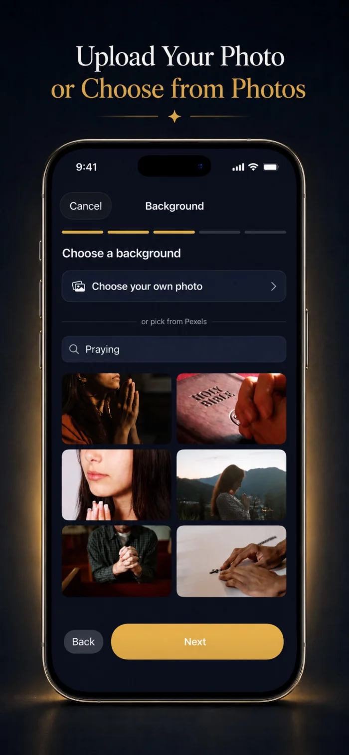
A photo that looks great on its own doesn't always work well as a widget background — text needs somewhere to sit clearly, which changes what makes a good choice.
Leave room for text
A photo with a naturally darker, simpler area — like a sky, shadow, or plain surface — gives overlaid text somewhere to sit clearly without competing with busy detail.
Consider contrast, not just color
Light text needs a darker area to read clearly, and vice versa — checking contrast in the specific spot where text will actually sit matters more than the photo's overall brightness.
Vertical orientation fits widgets best
Since most widgets are taller than they are wide, a portrait-oriented photo (or one with a flexible, croppable composition) usually fits more naturally than a wide landscape shot.
Can an overlay or dimming effect fix a photo with too little contrast?
Yes — a semi-transparent dark overlay over a busy or bright photo is a common, effective way to make text readable without needing a different photo entirely.